


Due to advancements in technology trends are now changing and if you have a responsive Web Design then you can easily get your target audience in a Good Way. Being responsive is not only about pretty layouts and attractive designs, but it also has to be load fast without any difficulties. We are the best Web Design Company and we have created some common Responsive Web Design Challenges And solutions that are faced by most of the users.
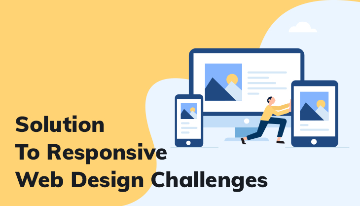
Responsive Web Design: Challenges And Solutions
Showing Data On Small Screens
Displaying data tables on a tiny screen is a problem when the tables are complex and if the table is with a great number of rows and columns that it does not fit into that small screen.
Solution: you can create responsive tables by several methods such as abandoning the grid layout, creating a smaller table that doesn’t need horizontal scrolling, developing more compact pie charts out of tables.
Creating Rich Experiences That Load Fast
The difficulty faced by most of the developers is finding a perfect balance between a fast-loading website and a great user experience. A responsive website can easily attract traffic from both mobile and desktop users but it to target customers.
Solution: The solution to the above problem is conditional loading, which enables loading when they needed it in the perfect time frame.
The Appearance Of Background Images And Icons
Photos play a most important role in obtaining great user’s experience on the web and if your site is responsive, your images and icons should be clearly displayed in high pixel density devices. If the images are blurry and poorly scaled up then you might end up losing your potential customers.
Solution: you can make your site scalable using the free SVG converter format and retina-ready display allows users to enjoy the high-quality icon experience.
Longer Designing, Developing, And Testing Periods
An effective website should work on multiple platforms hence building that type of need longer designing, and testing time period. It takes twice as long to design a responsive site compared to a normal site.
Solution: if you create a responsive site at the beginning of the development phase itself then you can save a lot of owner’s time and efforts.
Hiding And Removing Content
Websites that have extra content in the variety of forms such as complex UI elements, advanced search features, dashboards, more often cause a problem because they contain huge amounts of data.
Solution: plan and organize your content ina way that does not force developers to hide or remove anything from the content. The aim should be to optimize at the maximum possible range, removing unnecessary elements from early drafts and give importance to the core structure of the website.
The Problem In The Visual Stage
Designing is the process of sketching and prototyping where the focus is on design elements and how they will be organized, according to their dimensions and resolutions. In case if there is any problem in the designing stage then there is a chance that you can go down in the Google algorithm.
Solution: There are two methods in creating responsive sketching. The first one is developing sketches for a desktop home page and other website pages, then adapting them for the several types of tablet and mobile screen sizes. The other method is using paper and communicating with the client to represent design layouts so that you can develop visuals without any error.
Navigation
Users can find the navigation button on the top left corner of the webpage and many users still find it difficult to navigate beyond the menu. If the structure of your website is complex, then the user cannot find the navigation button.
Solution: To make your navigation Design effective and responsive, then the designers should spend more effort and time on making the design intuitive. To make a unique navigation design, you need to study the entire website content and information architecture.
Converting Fixed Sites Into Responsive Ones
You may be in a confused state: is there is any s need for changing the fixed-layout of the website or it can be left untouched because it delivers an acceptable performance.
Solution: you can easily convert or change the Fixed pages of light and simple websites. You can change it using templates and reverse style sheets, and in case of bigger or complicated websites then you need to go for rebuilding.
CSS3 Media Queries Does Not Work Properly In Older Versions Of Internet Explorer
Many users do not update their devices and if your website design does not fit in their older version of IE hence, they may leave your site. In this situation, developers should have to find a proper way to support an older website version on their mobile devices.
Solution: you need to give importance to your internet explorer users by giving them a proper solutions. Using Java Script, A well skilled experienced designer can change page layouts according to the size of the browser window.
If Your Website Is Not Responsive
Every visitor attracts to the website which is very responsive and if you want more conversion rates then your website should load at a faster rate. When your website is not responsive then there is a chance that you may possibly lose your customers.
Solution: if your website has responsive design then it is the best way to earn the credibility of the customer. You can make your web design responsive mobile-friendly design.
Conclusion
Responsive web design is now becoming a trend and by designing a responsive site, the website owner can achieve many benefits starting from a higher conversion rate to more revenue generation. The above is some common Responsive Web Design Challenges and Solution but, there are no professional solutions to the challenges that this trend poses.


Post Comments