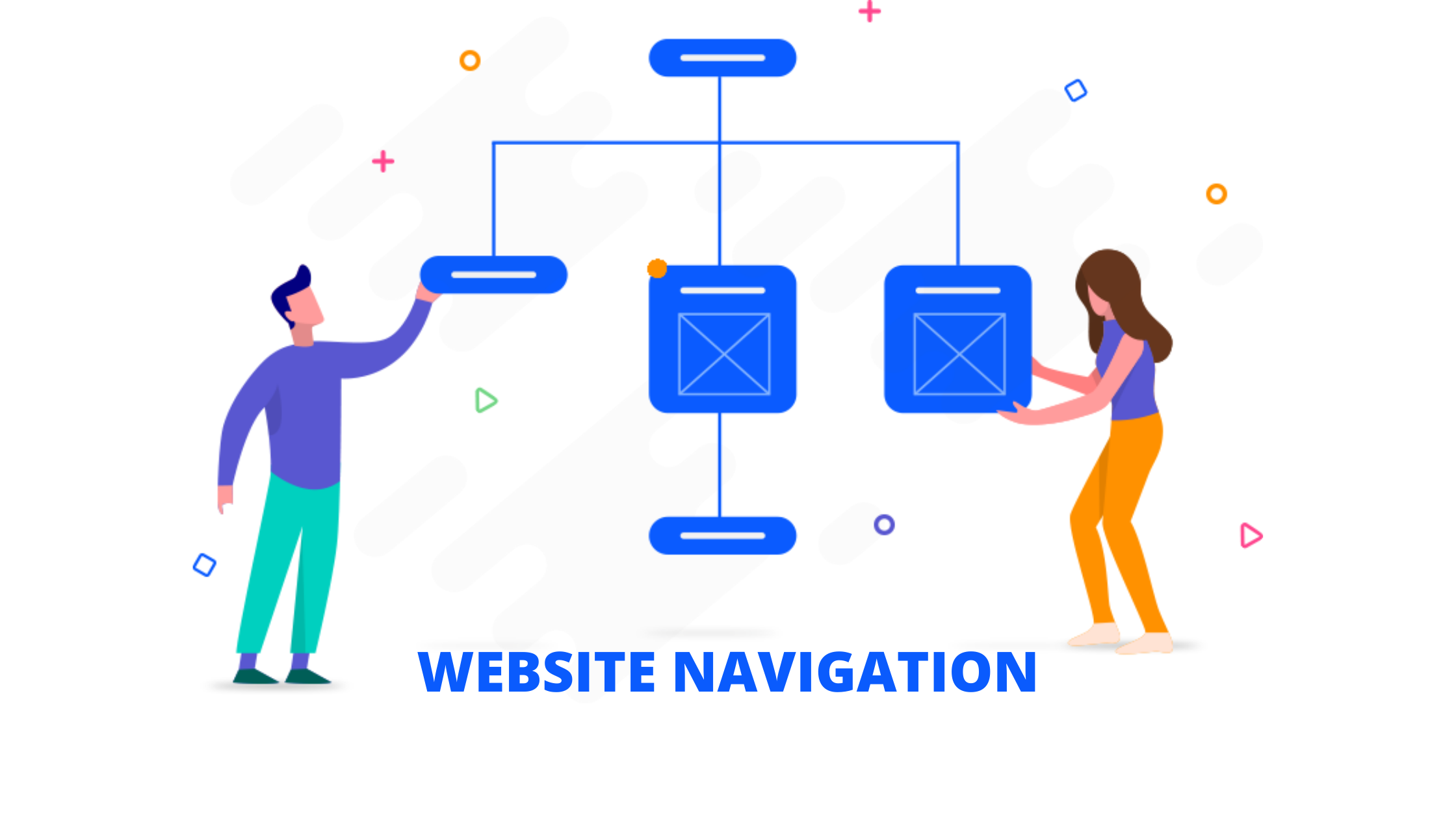
WHAT IS WEBSITE NAVIGATION?
Website navigation is basically a process of navigating a network of info resources on the net which is organized as hypertext or hypermedia. Website navigation is very important for SEO since it gives your website a structure. In addition, it also helps search engines to comprehend your website as they crawl the web via links. You can help in teaching the bots of Google as well as its competitors by highlighting some really valuable content, keywords and key landing pages. Here are 7 best website navigation practices you should keep in mind looking at both header and footer menus to organize all the content that happens in between.
WEBSITE NAVIGATION BEST PRACTICES
1. Be descriptive
The heading of what we do does not actually say what you do. Likewise is for products, services and solutions. Descriptive navigation should be such that it uses key phrases as it is better for two reasons and here is where SEO and conversions come into picture.
Descriptive labels in navigation are great for Search Engines - The navigation bar is considered to be the main place where you can show the relevance to search engines. Because of the fact that your navigation appears on each and every page, the descriptive label shows search engines that you are truly committed about that topic.
Descriptive labels in navigation are great for visitors - Your navigation bar is visually important and so it communicates instantly with the visitors. When it lists your main business offerings, products or services, it will be obvious what your company does up front. Hence, they will know they are in the right place.
2. Avoid dropdown menus
Avoiding dropdown menus is good for two reasons which we have mentioned:
It is great for search engines like Google - Drop down menus can be really difficult for search engines to crawl and so depending on how they are programmed, they may lead to problems.
It is great for your website visitors - Usability studies have proven that dropdown menus are very annoying because visitors move their eyes quicker than they move their mouse. In such a situation, when they move their mouse to a menu item, they have likely already decided to click but then you give them more options and then it becomes a hiccup in their mind.
3. Limit the number of menu items
Some websites have hundreds and thousands of links on the homepage which is bad. Make sure to limit the number of links in your main navigation. Reason is that fewer items in your navigation are good for search engines. Your homepage has the most visibility and authority with search engines as more sites link to your homepage. If your homepage has hundreds of links, it will dilute the authority passed from it down to your other interior pages.
4. Avoid format based navigation
Navigation labels like photos and videos tell visitors the format of the content. However, ot does not tell the topic. People do not really go to websites looking for photos Or videos. They simply visit websites looking for answers and information that can feed their quest. Labels indicating the format are not descriptive and so it is not very helpful to visitors. This is the reason why we are against using format-based navigation.
5. Order of website navigation is imperative
The number of items do matters, but the order of those items matter more. Items in the beginning as well as in the end are considered to be most effective. It is because this is where attention and retention are highest. It is also called the serial position effect. For this very reason, anything we put at the beginning or at the end of navigation becomes very prominent. We should put the items which are most important to our business as well as our visitors in these places.
6. Website navigation on mobile devices
Responsive web design has introduced with it some of the best mobile navigation practices and standards. It can also be called as hamburger icon which is basically an icon made up of three short horizontal lines that represents a menu. However, it looks somewhat like a sandwich and so people call it the hamburger icon. It also appears in the top right corner of the mobile websites and clicking it reveals the whole navigation menu.
7. Optimize your website’s navigation
Designing your navigation is just the start not the end. A few weeks after creating your website navigation, you can start using advanced Analytics to look back and do evaluation. There are two reports which will show you which navigation items are the most used ones by your site visitors. One is the “navigation summary” which is also known as in-page view in the Behavior report and the other one is the Behavior Flow Or User Flow reports. Use both the reports to optimize your Websites navigation and that will solve much of your problems.
CONCLUSION
We hope this article was useful to you and you enjoyed reading it as much as we enjoyed penning it down. Your website navigation should guide the users to the actions that you want them to take although if they are not aware of what action they want to take. Keep in mind all the ways we shared with you and follow all the do's and dont's and we are sure you will get through it super soon. In case you need any help regarding website navigation, feel free to get in touch with our experts.